

Your social media banners are your billboards on the internet highway, no matter which channel you use! Nothing more nothing less! If you are wanting to put yourself out there, design something professional that will spark interest and let you stand out from the rest of the crowd! Sell your brand well, first time, every time!
I had a lightbulb moment the other day after doing a shoot for a client that needed updated advertising content for their billboard in the city where I live. Far too often, including me, we post a “nice” image up on our banner on Facebook and it may stay there for quite some time. We endeavour to generate as much internet traffic through the social media channels we use, as it is ultimately advertising that we are doing to potential vendors out there to make use of our skills and services.
That’s when the penny dropped! It is no different to you driving down a busy highway and seeing a giant billboard advertising a brand, idea, product or service. Some billboards are punchy and eye-catching, others very quirky and punny, as well as funny, and others that are seriously bland. I recall about 15 years ago in Pretoria, seeing a large billboard advertising luxury cars and the slogan was “7>6” that is 7 is greater than 6 and that the BMW 7 series was greater than the Audi A6. Mathematically it is true, 7>6. Ultimately BMW was trying to say that their brand of luxury cars was better than Audi, albeit both are German manufacturers. Clever advertising like this stands out and makes you think, yes, seven IS greater than six and you don’t forget it. In response to this, 500m down the same highway, Audi responded with “8 is better than 7”! They weren’t taking this one lying down, they were saying their A8 was better than the 7-series BMW!
How much different aren’t we as photographers when it comes to selling our skills and brand when competing against a newbie who has just walked into a camera store, bought an entry level setup and is suddenly a professional? You have taken time to build a brand, a name for yourself, why shouldn’t it show in every dimension of what you do and who you are. If you are professional, show that be noticed, stand out from the rest of the crowd! YouTube is a great source of information, use it if you stuck with a skill that you need to learn when designing in Adobe Photoshop, Illustrator or Indesign. Adobe has a great tutorial on How to amp up your Facebook profile, which is easy to follow and will help you to get your creative juices flowing.
Follow seasonal trends as advertisers do when it comes to marketing. An example could be Valentines Day, change your banner to reflect that sale for that event and brand it accordingly. The first thing any visitor is going to see are your social media banners when they search for you on Facebook, Twitter, LinkedIn, Instagram etc. Make an impact the first time so that your visitor likes, stays, uses your services and recommends you to someone else.
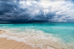
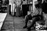
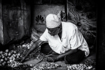
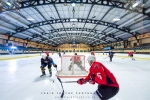
Below are some examples of Facebook social media banners that I have designed for my client and my page:
The ideal designing size for Facebook is 1920 x 1080px. Yes is way deeper than the traditional letterbox size, it is however a 16:9 aspect ratio which is also the size for HD video. Well, what has this go to do with Facebook you may ask? We are now able to upload videos as an alternative to photos to the banner, and slideshows too.
The OLD shallow letterbox size (which you’ll still see recommended by a lot of people) is:
Aim for a high resolution, as there are users out there with retina displays, futureproof yourself by sticking with 1920 x 1080 px; 820 x 461 px still looks the sharpest on older screens. The upside is a lovely deep photo to play with that renders in all its depth on mobile. However, on desktop it gets cropped a little.
These deep dimensions give the best view on mobile as it uses the entire photo and gives you the largest area possible for the photo on the native app. It also gives you a larger area for any text that Facebook itself places on top of the photo in some scenarios.
As you don’t have an option to upload different variants for mobile vs desktop rendering you need to be concious of where your photo will get cropped on different devices. Keep text to the safe area and ensure that nothing else in the picture looks weird when savagely cropped.
This is how the different photos actually surface on different devices.
Facebook Group cover photo dimensions:
For all the above create your image as 1920px x 1080px
Facebook Page cover photo dimensions:
For all the above create your image as 1920px x 1080px
Facebook Profile cover photo dimensions:
For all the above create your image as 1920px x 1080px
Also be aware that what you see will also vary on which browser/app variants you are using. Facebook treats each of these three variants differently:
This is where we really are with Alice down the rabbit hole) the photo is then cropped differently depending on where it surfaces – eg as a recommended Group vs on the Group’s home url.
It is important to optimise the photo correctly – a lot of image problems are to do with poor optimisation.
It is recommended using a .jpg for optimum resolution at the smallest file size. The best way to do this is using something like Adobe Photoshop and exporting the image with ‘save for web’ as this will optimise the image better and give you a smaller file size.
If you don’t have Photoshop there are several free services online that you can use. Most of the photo libraries have photo editors on their sites now. Try https://www.shutterstock.com/editor which has plenty of social media templates and enables you to edit and resize your own images for free (i.e. they don’t have to be Shutterstock pictures). Another excellent tool to use is Adobe Spark, as a Creative Cloud user, this is part of your package.
For a Photoshop Social Media Banners template for Google+, Facebook, Twitter and LinkedIn click here to download.
Disclaimer: Social media sizing dimensions and information found on various sources on the internet.
Please subscribe to my free monthly NO-SPAM newsletter which will inform you of any new workshops, activities, products and upcoming events.
SUBSCRIBEI am a Western Cape Winelands photographer based in South Africa, photographing locally and internationally. I am a registered NPS (Nikon Professional Services) member, a contributor to Nikon South Africa's social media pages and website. I photograph a broad variety of genres, using film - 35mm, 120, 127 and 4x5" 4x10, 5x7" & 8x10" format as well as digital medium and are very passionate about my work.
My work has been published in various South African newspapers and magazines including Atlantic Gull Magazine with a cover, SA4x4, HIGH LIFE (British Airways Magazine), Getaway Magazine, Wildside Magazine and Weg!/go! Magazine. I finished as a Top Ten finalist in the 2016 Getaway Magazine Gallery Competition, finishing with Highly Commended. The South-African national news broadcaster eNCA has also made use of video footage that I have produced.
Please feel free to comment and share. You can also click on the social media buttons in the footer below and see what I am currently doing, or sign up for my newsletter and follow me.
Until next time, thanks for your support, appreciating my work and reading my blogs.
Craig Fouché, Rogge Cloof, Sutherland, South-Africa ©2020 Kirsten Frost Photography