





A lot of people have come to me over the various online photo sharing sites – especially flickr – asking me how I get the colors the way I do on my scanning and editing colour negative film. People have been most curious about my color negative film shots, particularly the ones taken on Kodak Ektar film. For an overview of the various film types I use, see my blog post here. I’ve been wanting to do this for a long time to help everyone out and here it finally is! There will be a lot of photos and a lot of text, and if everything goes right I will help a few people out. At the very end I will have a Photoshop file with all the layers for you to play around with and learn!
Disclaimer: This is not necessarily the right or only way to do anything, this is just an outline of the general workflow I use.
The photograph – This image was taken in rural Pennsylvania last month about an hour after sunrise. The light filtering through the trees was still very warm and pleasant, and there was a hint of haze in the air making for a wonderful sense of atmosphere. The leaves had just sprouted on the trees and were very green in person. I planned on cropping the image to a panorama while framing it, but I don’t crop an image until the very last step. All of these things are important to keep in mind as you scan and edit the film. The image was shot on Kodak Ektar 4×5″ film, and the exposure was 1 second at f32. The film was developed at home with a C-41 press kit.
Scanning – First off, I want to say that scanners don’t really seem to care how your film looks. They don’t know where you were, what you were photographing, or what your vision is. They just want to turn that sheet of film into data and they do it well enough. For those of you who don’t know, I photograph primarily with a large format 4×5 inch camera that produces wonderfully large negatives with incredible detail. The film records all the details and rich colors, but it’s up to us to pull those colors back out of the image after it is scanned.

Epson Scan with no color corrections
I use an Epson V700 flatbed scanner for all of my scans. Of course it is not as good as a high-end drum scanner, but it is a fairly popular home-use scanner among large format photographers and great results can be had from it. I start by using the Epson Scan software that comes with the scanner in “professional mode,” which just means that you have more access to features and color correction options while scanning. I make a preview scan with the film type set to “Color Negative Film.” You will end up with some very cyan colored rough scans. This is more or less just an inverse view of the orange-brown colored sheet of film. Not very pretty to look at. I click the “Configuration” box (marked above with the red arrow) and then go to the color tab and click on the “Continuous Auto Exposure” checkbox, set the slider to low (see image below) and click “OK”. All I want at this point is to get the image looking a little more color-correct without the scanner messing up my image by stealing precious details.

Epson Scan with auto color correct
Unfortunately, even with the slider set to low, it still manages to clip some of the highlights and shadows. I still use the auto exposure feature because it typically does a good job of getting the colors somewhat right. Now we need to bring back those details that Epson Scan wants to take from us. Click on the levels adjustment button on the left of the screen (see below).

Now you’ll see the histogram and will be able to tell where Epson Scan has clipped the shadows and highlights. We’re going to want to make some adjustments to this to make sure we aren’t missing any details in the shot. A small adjustment goes a long way (see image below). As a warning, the histogram displayed in Epson Scan does not seem very accurate, and you may decide to not move the right marker all the way to the edge of the graph. If you do, the image will become incredibly dark, and the software will quite often really mess up the colors. For this reason I leave it a little bit away from the edge but the highlights are still safe and not blown out. I move the shadows marker quite a ways past the end of the histogram, I want to be able to set the black point later on. See the image below to get an idea of the adjustments I made on this image.

This image had fairly accurate colors so I didn’t mess with them in Epson Scan, but if you need to you can select the various color channels and move them around a bit. Quite often, Epson Scan will add a lot of red to the image when you mess around with the levels adjustment. This can be fixed by sliding the right slider in the red channel just a couple of numbers to the right. No need to get anything perfect yet, we’ll save that for Photoshop when we can see the image in full size. Right now we just want a flat, low contrast image with all the highlights and shadows still intact. Go ahead and scan as a *.tiff file.
Editing – Now comes the part where we make the image look the way we want. You need to picture the scene as it was and remember how you wanted it to look. With color negative film, there really is no “correct” color. If you were to make an exact inversion of the film it would just be a cyan colored mess. You need to choose the way you want the colors to look, just as someone would when making traditional darkroom prints. A few years ago, I borrowed a digital camera from someone and really enjoyed the easy adjustments that Adobe Camera Raw (ACR) has to offer, especially for simple global color correction. It got me to start opening up my scans in ACR by going to file>open as and selecting “Camera Raw” from the drop down list and then opening the tiff file. If you have Lightroom, it’s probably a much better program than ACR. I just use ACR because it’s what I have. Use whichever you prefer here.

There isn’t really much rocket science to what I do in ACR. I use the tint and color sliders to help get the colors close. The scene as I remember it was very warm and there was no need to have any blue in the road, so I moved the slider towards the warmer colors and the tint slightly towards the green. Other very handy features in ACR are the “recovery” slider to help with overly bright highlights, “fill light” to bring up the shadows, and the “Graduated filter” button up top. The graduated filter lets you easily adjust parts of an image that need extra contrast, more exposure, or maybe have a slight color cast. Play around with every button in this program. I also use the “vignette” slider in the lens correction tab to help get rid of the the vignette that happens on most wide large format lenses. This image was taken with a longer lens so it didn’t really need it. As you can see above, the image is still not very contrasty and I haven’t adjusted the saturation at all. Now it’s time to open the image into Photoshop and make the final adjustments.
Photoshop – The very first thing I do in Photoshop is make a copy of the background layer. I use this layer to remove any dust and scratches using the healing brush tool. After that is done, I move onto luminosity masks. You may or may not be familiar with luminosity masks, but they are a very handy feature in Photoshop. I will only explain them briefly for now, there are many other resources on the internet that can explain them in greater detail for you. Please let me know if I lose you here, I’d be glad to re-word or explain things for you.

Luminosity Masks – By pressing Ctrl+Alt+2, Photoshop will create a selection similar to what you see above. Pixels will be selected based on their brightness, with a pure white pixel being selected 100% and a pure black pixel not being selected at all. Everything in between is selected proportionally based on its brightness. Once you have this selection, I like to start by making a curves layer with it by going to Layer>New adjustment Layer>Curves on the top menu. Now you have a curves layer that will mostly just adjust the highlights in the image. I then Ctrl+Click on the curves Layer to get the same selection again and inverse the selection by going to Select>Inverse on the menu at the top. I then make another curves layer just as I did before with this selection, only now it will mostly adjust the shadows. When you Alt+Click on the image for this new layer, you will see something that looks like the image above-right. This is more or less a black-and-white negative of your image, where any curves adjustment you make will affect white areas the most and black areas the least.

Red channel curves adjustment made to the shadows
I find that a curves layer that adjusts the shadows is a great way to remove some of the unwanted shadow color casts that film scans tend to have. Ektar likes to have too much red in the shadows, while some of the slide films like Provia will quite often have way too much blue. This has been one of the main keys to getting the colors right on my scans.
Once you get the hang of these selections, there are all sorts of things you can do with them. You can use the brush tool to cover part of the mask with black, or use a white brush to increase the area that will be affected by the adjustment layer. You can do a whole lot more that just curves adjustments, using the masks to apply contrast, levels, saturation, vibrance or whatever to a specific part of the image. I you want a particular patch of trees to be brighter, just mask it off and make your adjustment. Really feel free to bring the image back to the way you wanted it to look when you took the photo.
Hue/Saturation Layer – I have found this to be a necessary adjustment for color negative films. This image didn’t need it very badly because it didn’t contain and blue sky but I have found that I typically need to remove a significant amount of cyan from skies to make them look natural. Color negative film really seems to have an excess of cyan, and to be honest it’s not my favorite color. I will likely make another tutorial just about this with a different image just to show you what I’m talking about. It’s not uncommon for me to adjust the cyan slightly towards blue with the hue slider, and then desaturate it as much as -50. For now, just go to Layer>New Adjustment Layer>Hue/Saturation and play around with it. It is really easy to go over the top with saturation so I like to keep it subtle. Sometimes I will walk away from the screen and come back later to let my eyes re-adjust.
Here’s the final image!

For now, I think I will turn you all loose with the Photoshop file that has all the layers in it so you can see exactly what I did. It might be the easiest way to illustrate my workflow. If you have any questions about what I did, feel free to ask me in the comments and I’ll try to explain or add it to the tutorial. Click the button below to get the .psd file.
Thanks for looking, I hope this helps some of you out there!
Used with kind permission, check out Alex’s website, click here. Since the time of writing, Adobe has updated Lightroom, Adobe Camera Raw and Photoshop, the sliders in ADC have changed.
Please subscribe to my free monthly NO-SPAM newsletter which will inform you of any new workshops, activities, products and upcoming events.
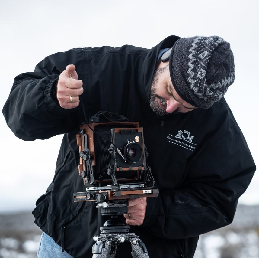
SUBSCRIBEI am a Western Cape Winelands photographer based in South Africa, photographing locally and internationally. I am a registered NPS (Nikon Professional Services) member, a contributor to Nikon South Africa's social media pages and website. I photograph a broad variety of genres, using film - 35mm, 120, 127 and 4x5" 4x10, 5x7" & 8x10" format as well as digital medium and are very passionate about my work.
My work has been published in various South African newspapers and magazines including Atlantic Gull Magazine with a cover, SA4x4, HIGH LIFE (British Airways Magazine), Getaway Magazine, Wildside Magazine and Weg!/go! Magazine. I finished as a Top Ten finalist in the 2016 Getaway Magazine Gallery Competition, finishing with Highly Commended. The South-African national news broadcaster eNCA has also made use of video footage that I have produced.
Please feel free to comment and share. You can also click on the social media buttons in the footer below and see what I am currently doing, or sign up for my newsletter and follow me.
Until next time, thanks for your support, appreciating my work and reading my blogs.
Craig Fouché, Rogge Cloof, Sutherland, South-Africa ©2020 Kirsten Frost Photography