










Here are a few important composition tools that one can use in post edit or straight out the camera. Photoshop has some of the following tools present in the crop tool that I would like to discuss and share with you:
Yes, all the experienced photographers do or should know the “golden” rules of composition and use them almost innately. But before you start to use these simple rules without thinking, you need to practice, think what is better, and read about these rules or guidelines.
You hear photographers talk about composition all the time, but what exactly is composition and how is it different from subject? Simply put, composition is the way that elements are arranged in an image. Composition includes all the elements in a photo, not just the primary subject.
The human eye tends to prefer images that have a certain sense of order, while it tends to reject images that are chaotic. That’s the basic difference between good composition and poor composition, though it’s obviously a lot more complicated than that when you move past the basics.
In order to develop a good understanding of what works and what doesn’t work in photographic composition, it helps to learn the “rules” and practice following them. And there are a lot of rules. You’ve probably heard of at least some of them, but they are worth repeating. Remembering, of course, that these are really more guidelines than actual rules.
There are no fixed rules in photography, but there are guidelines which can help you to increase the impact of your photos. To make your images more appealing, apply the picture composition tools and rules while taking the photos. Poor photo composition can make a fantastic photo dull, but a well composed frame can create a wonderful image from the most ordinary of situations.
As a beginner photographer at camera club, we were taught to look for the following shapes in our compositions: S, O, L, T, A, X, as well as to incorporate the well-known Rule of Thirds or Fifths. I am willing to say that above 90% of photographers would have begun using the Rule of Thirds, and still do. I don’t believe that many compose outside of that box with the other above mentioned composition tools.
The king of compositional rules! Any photographer who does more than just take snapshots knows something about the rule of thirds. The basic theory goes like this: the human eye tends to be more interested in images that are divided into thirds, with the subject falling at or along one of those divisions. Many DSLRs will actually give you a visual grid in your viewfinder that you can use to practice this rule. If yours doesn’t, just use your eye to roughly divide your image with four lines into nine equal-sized parts, then place your subject at the intersection of those lines. For example, when photographing a person it is generally better to position them at the right or left third of the frame rather than directly in the middle. It makes for a more interesting image.
The diagonal method (DM) is a rule of thumb in photography, painting and drawing. Dutch photographer and lecturer Edwin Westhoff discovered the method when, after having long taught the rule of thirds in photography courses, he conducted visual experiments to investigate why this rule of thirds only loosely prescribes that points of interest should be placed more or less near the intersection of lines, rather than being rigid and demanding placement to be precisely on these intersections. Having studied many photographs, paintings and etchings, he discovered that details of interest were often placed precisely on the diagonals of a square, instead of any “strong points” that the rule of thirds or the photographic adaptation of the golden ratio suggests. A photograph is usually a rectangular shape with a ratio of 4:3 or 3:2, in which case one should look at the bisection of each corner. Manually placing certain elements of interest on these lines results in a more pleasing photograph.
While the rule of thirds divides your scene into equal thirds, the golden ratio divides your scene a little bit differently, into sections that are roughly 1:1.618. Unless you are a mathematical genius, you’ll probably need to see this visually. Think of a nautilus shell split open, overlayed on this box image, with the spiral starting in the smallest box.
With the idea being that a perfectly composed image should follow the lines in this rectangle. As you can see, instead of being evenly spaced as they are in the rule of thirds, golden ratio lines are concentrated in the centre of the frame, with roughly 3/8ths of the frame in the above part, 2/8ths in the middle and 3/8ths at the bottom. This idea has been around for centuries – millennium, really, and can be found in many of the great classic works of art, the Mona Lisa is but one example.
Some argue that the rule of thirds is simply a simplification of an even more advanced mathematical equation known as the golden ratio (also known as the golden mean). The golden ratio is a ratio which has continued to surprise artists, scientists, musicians and mathematicians for centuries. The reason being is that the golden ratio seems to pop up everywhere. Not only does the golden ratio pop up in everywhere, it also seems that the human eye is very attracted to the results of the ratio.
For example, there are certain measurements on models faces which equal surprisingly close to the golden ratio. In nature we see the golden ratio in plants and the branching of trees, the spirals of shells, the curves of waves, in our DNA and the solar system, the Milky Way is an example. It has also been used in architecture, art and music. The golden ratio seems to be everywhere.
It was used in architectural masterpieces such as the Greek Parthenon, the pyramids and later in such great works of art such as Notre Dame. There is also cause to believe that it was used by the great artists Michelangelo and Leonardo De Vinci.
Until now we’ve discussed the perfect rectangle, which at 5:8 roughly corresponds to the size of a 35mm image. But if your image has diagonals, try composing it using “golden triangles.” To do this, divide your image diagonally from corner to corner, then draw a line from one of the other corners until it meets the first line at a 90 degree angle. Now place your photograph’s elements so that they fall within the resulting triangles.
The golden triangle is another good composition tool or guideline to use when your photograph contains strong diagonal elements. It involves splitting the photo into three triangles that contain the same angles. The golden triangle is simple and works the best with lines but almost every photo will benefit from applying it. All you have to do it to imagine lines going through your photo. The framing does not have to be precise; an approximate framing will do well.
One right-angled triangle runs diagonally from corner to corner, while the other two triangles are created by drawing a line that goes from one of the other corners to meet the diagonal line at a right angle as in the image below. Try and place the diagonal elements in the frame so that they follow this pattern for a pleasing composition. You can see how the triangles follow the mountain profiles.
The golden spiral, as you might guess, is a compositional tool for use with objects that have curving lines rather than straight ones. This spiral is drawn based on that complicated series of rectangles we saw above, but you can actually visualize this based on nature’s nautilus shell, which matches the golden spiral shape almost exactly. If that seems a little too convoluted to you, just look for compositions where there is a spiral that leads the eye to a particular point in the image. In the case of the leopard, it follows the shape of the ear, the roundness of his head and finally the leading line of the left front leg going backwards towards the top left corner of the image.
The rule of odds is somewhat related to the rule of thirds. The eye tends to be more comfortable with images that contain an odd number of elements rather than an even number. My photograph of three pelicans, for example, is more appealing than an image after that third bird flies away. The reason for this is that the human eye will naturally wander towards the center of a group. If there’s empty space there, then that’s where the eye will fall. As a photographer, you want your viewer to look at a subject, not at an empty space.
This rule incorporates two very similar ideas: breathing room and implied movement. The leaving space rule should come naturally to you, but if you need a way to visualize it think of your image as a box and your subject as something you’re going to be inserting inside that box. The subject will space to feel comfortable, not confined. Implied motion means that if your subject is in motion you need to give some space that it can move into or out of.
The rule of space may seem to contradict this next rule, which is the idea that you should fill the frame with your subject. Filling the frame, of course, is different than crowding the frame. Crowding the frame means that you’re breaking that rule of space and putting your subject in a constricting box. The “fill the frame” rule, on the other hand, simply means that you’re looking for distracting background elements and cropping them out whenever you can. Or put another way, decide how important your subject is and then give a ratio of the frame that is directly related to its importance.
As a general rule, simple images tend to be more appealing than complicated ones. Most times, less is so much more. You can do this by zooming in on your subject, using a wider aperture for a shallow depth of field, or simply cropping the image later in post processing.
By applying these composition tools, your photography can only improve. One should also look for elements of colour, texture, mood, repeating patterns, balance, leading lines, symmetry, depth and a different viewpoint. Many people shoot from eye level, don’t be afraid to shoot at ground level, you would be amazed at the results! Don’t forget to change the orientation of your camera, too many people shoot landscape orientated images and not enough portrait oriented images – go ahead, break the rules. Also, at the beginning of this article, I mentioned S, O, L, T, A, X, look for these shapes in your composition, and see how these tools can improve your images!
Please subscribe to my free monthly NO-SPAM newsletter which will inform you of any new workshops, activities, products and upcoming events.
SUBSCRIBEI am a Western Cape Winelands photographer based in South Africa, photographing locally and internationally. I am a registered NPS (Nikon Professional Services) member, a contributor to Nikon South Africa's social media pages and website. I photograph a broad variety of genres, using film - 35mm, 120, 127 and 4x5" 4x10, 5x7" & 8x10" format as well as digital medium and are very passionate about my work.
My work has been published in various South African newspapers and magazines including Atlantic Gull Magazine with a cover, SA4x4, HIGH LIFE (British Airways Magazine), Getaway Magazine, Wildside Magazine and Weg!/go! Magazine. I finished as a Top Ten finalist in the 2016 Getaway Magazine Gallery Competition, finishing with Highly Commended. The South-African national news broadcaster eNCA has also made use of video footage that I have produced.
Please feel free to comment and share. You can also click on the social media buttons in the footer below and see what I am currently doing, or sign up for my newsletter and follow me.
Until next time, thanks for your support, appreciating my work and reading my blogs.
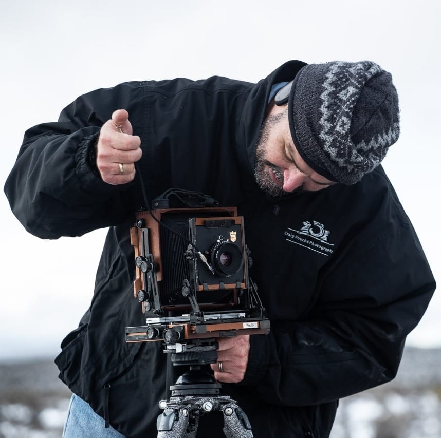
Craig Fouché, Rogge Cloof, Sutherland, South-Africa ©2020 Kirsten Frost Photography